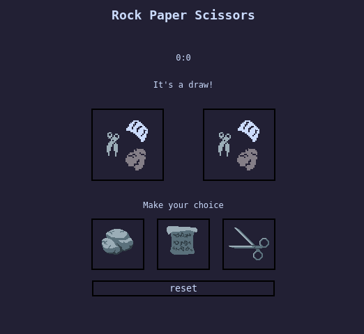
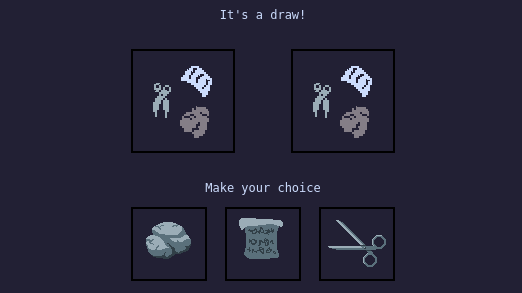
A simple Rock Paper Scissors game against AI opponent.
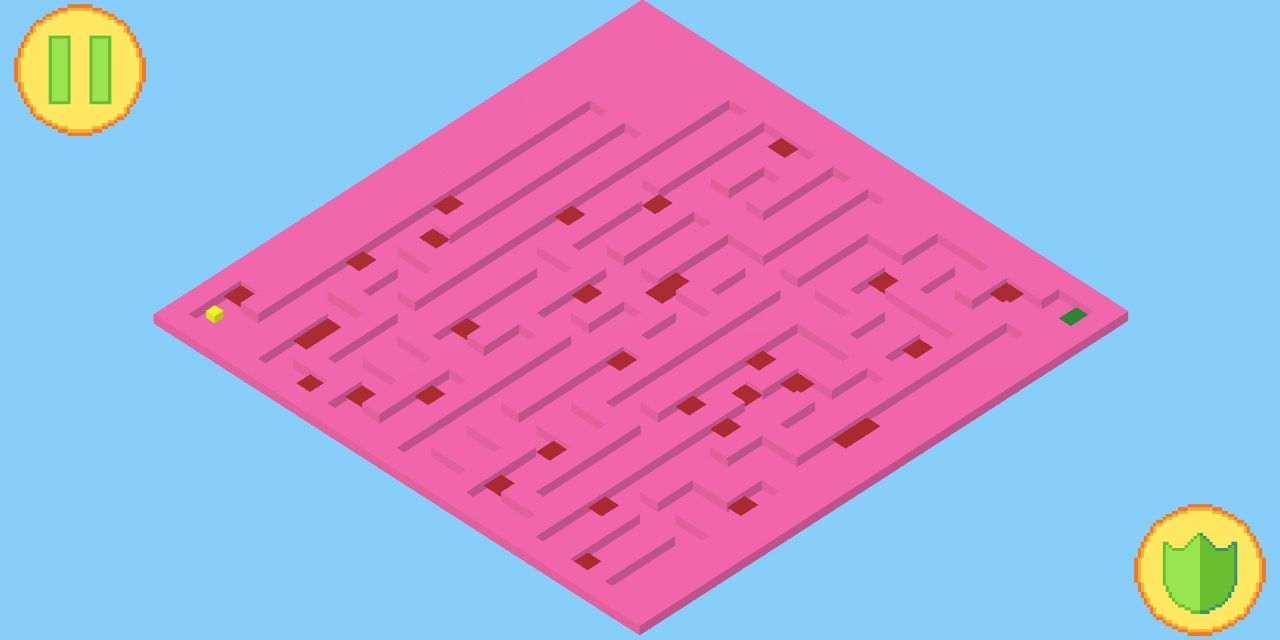
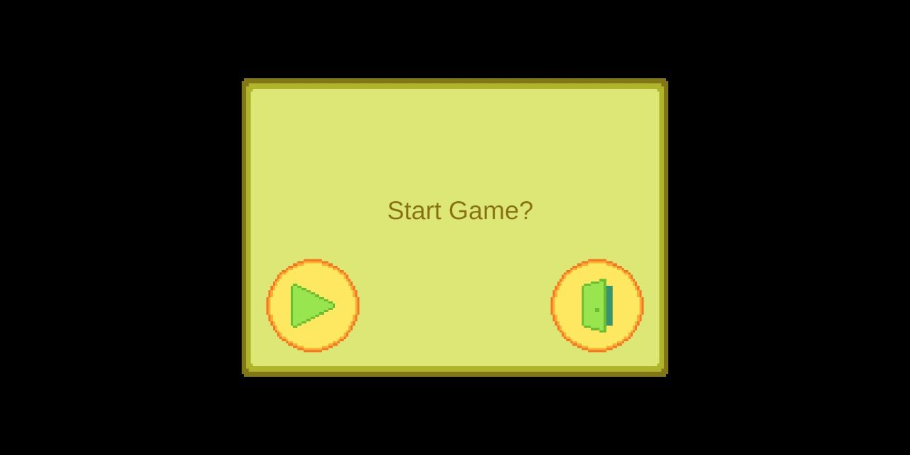
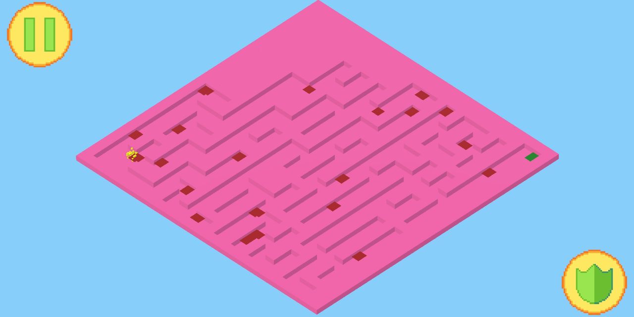
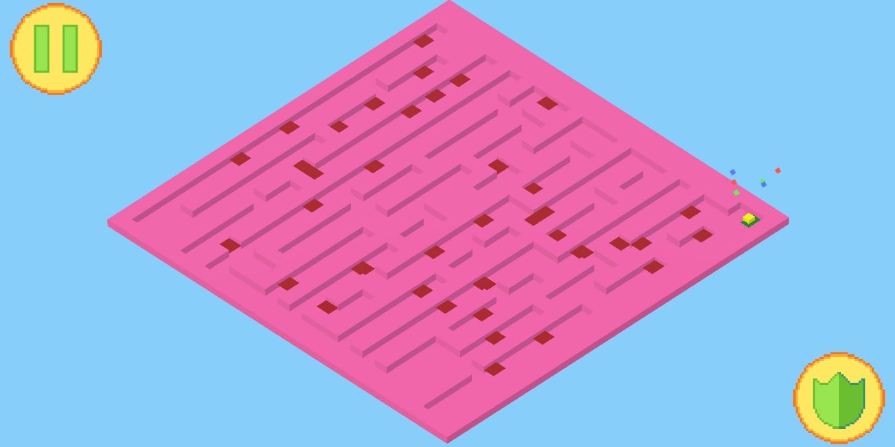
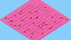
Super casual game for android phones. Help the cube reach the end of randomly generated maze by pushing the shield button when touching red zones.
MicroVania

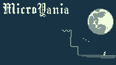
MicroVania is a short metroidvania game, made in simplistic 1-bit style. Most sprites are 16x16 pixels. The main mechanics of the game are moving and shooting. Movement in the game consists of running, jumping and wallsliding. You can also jump on enemies to deal damage.
You shoot with the mouse. The game uses projectile-based shooting. Some enemies can shoot at the player as well. If that happens, you can either dodge the bullets or shoot them down.
The game features 3 rooms and 5 types of enemies. Some enemies will be patrolling the area and will only attack you, if they see you. And if you get away, they'll go back to patrolling the area.
What makes this game stand apart from all others is its unique 1-bit color palette. Each screen will consist of only 2 colors. Different rooms will have different combinations to enhance the mood of the game.
Microvania is hugely inspired by oldschool Metroid games and early 20th century blues.
Sketchbook
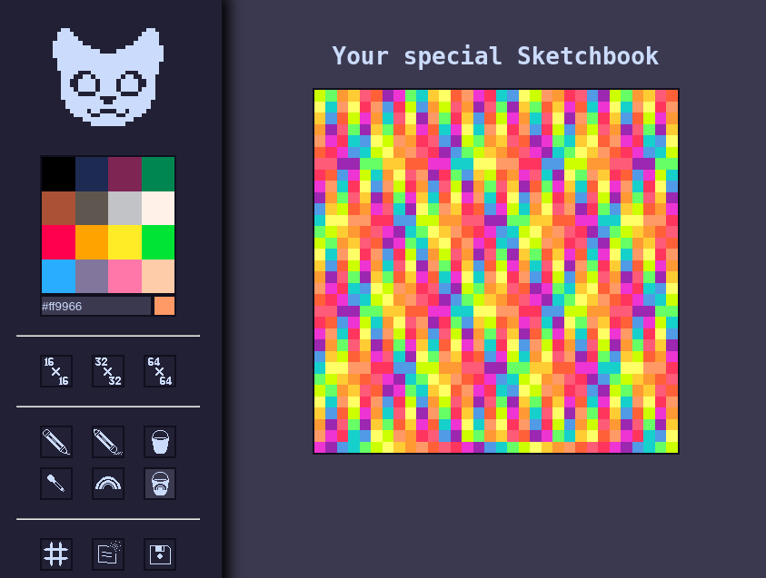
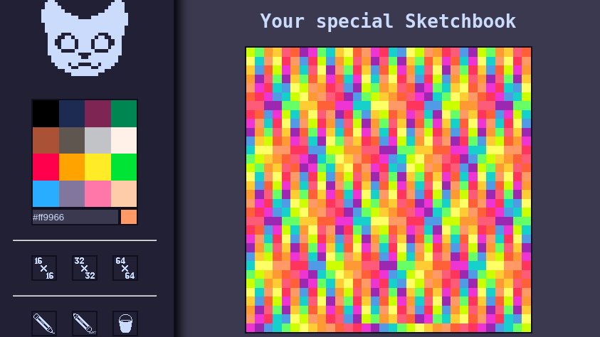
What began as a simple exercise for the Odin Project, on DOM manipulation using JavaScript, quickly became a fullfledged drawing app. You will find all the features a basic drawing app needs.
This game started as a test task. I had clear goals: make a system that builds random maze and have a cube solve it, make red zones that will destroy the cube and shield button that will protect the cube, make transitions and UI.
The hardest thing in that project was to develop maze generation. I've never done anything related to mazes or pathfinding algorithms, so it took me a while to figure out.
At first I tried the random approach. I build a 2D grid and then fill it with walls and spaces. Chance of wall was dependant on a variable I could adjust, but this approach failed to make sufficient results. Instead of labyrinth, it looked like random cubes on a field. Besides, most of the times, mazes were unsolvable. Before I tried something else, however, I managed to make an algorythm that ensures there's a path from the starting position to the ending of the maze.
The pathfinding system recursively searches the maze, marking all the tiles as either correct way or deadend. If search comes to a deadend, all the cells that lead to that point from the branching cell, a marked as deadends and the search goes on. If there are no empty cells left and the goal hasn't been reached, however, the maze is rebuild and the search is repeated.
After some tinkering I managed to get solvable mazes consistently. But I still wasn't happy with how it looked. So I reworked the maze-building algorithm.
Instead of having probability of having a wall on each cell, I made all the cells into walls, and curve paths afterwards. The new system randomly decides on directions procede from each cell and recursively goes until there's nowhere left to go. This method produced beautiful mazes with narrow corridors.
Next I made red zones that will damage the cube if it is unprotected. I used similar method I tried with maze generation initially. We look at each empty cell and with some chance make a red zone there. I could only spawn them only on the path to the end, but it looked better when they are all over the maze.
Having the cube move along the only correct path was a bit tricky, due to how physics engine works in Unity. I made a simple script that gives the cube a direction to move towards and then checks if its position is the same at the goal's. If it is, the goal it moved to the next cell.
The problem was the cube got stuck on the second cell. It just never got perfectly aligned with cell position. To fix it, I reworked the script to detect if the cube is 0.01 units close to the goal. It worked sometimes, but still caused the cube to get stuck.
Somehow it triggered the move-goal-to-next-cell script twice while the cube was aligned with the goal. I fixed it but only checking if the cube reached its destination if it wasn't reached already. And if it was, the cube would just move.
All the other systems were straightforward to make. I made a little animation of cube dropping in pieces when it hits the red zone and a confetti using particle systems. For some reason I couldn't make particles of random color, so I attached three particle systems each with different color.
It was time to make onscreen controls. Before that point, I tested the game inside the Unity Editor, using keyboard. And when adapting the controls to sensor, I faced a problem. How do you check when the button is not pressed?
In my game, you can only hold the shield button for two seconds. After that you have to release it to restore the shield gauge. With keyboard I used a simple if-else statement. If key is pressed, it's pressed, else, it is not pressed. But with onscreen buttons you can only trigger functions, not if-else statements.
To fix it, I found a script that checks the amount of touches on screen. If the amount is zero, you may refill the shield gauge, if more than one, execute the script. It works just the way I need it to.
The only things left to do were to make pause button and some simple UI effects. Instead of changing the timescale to 0, to stop everything, I simply made a isPaused variable. Most update actions are executed if this variable is false. I decided to do it that way, because otherwise the darkening screen effect won't be executed properly.
With that my game is finished. It's simple, but I learned a lot while making it.
This was an excersise, suggested by the Odin Project. The JavaScript part of this project was straightforward to do. So this little project mostly shows off my pixel art and design skills.
The Odin Project task was to make a field with boxes that change color when you touch them with the cursor. The problem was I didn't really know it. I read the title of the exercise and instead of reading hints, tips or even the required tasks, I decided to look at what other students've done, and do something similar or better.
The first thing I realized when looking at other works was that they are all very basic. You can't realistically use it for anything, other than showing off to someone who've never done any programming in their life. So the concept of something I can actually use came to me naturally.
The basics, like drawing a canvas and changing the colors of the blocks, wasn't very hard to setup. Drawing only if the mouse button is pressed, was much harder. No wonder almost no other student bothered with it. The solution was to paint the pixel if the button is just pressed AND if the cursor entered the pixel with button already pressed. I also needed to disable the highliting of pixel elements, otherwise the basic functionality of browsers will get in a way of art.
Other works used some prebuild app to pick color. It looks cool and is very functional, but seeing pretty much everybody using a pre-made solution discouraged me from using it. Instead, I made a palette with pico-8 colors and a textbox to insert custom value. The textbox will accept either hash or RGB value. The algorythm I've written checks which one the user inserted and parses it accordingly. To hint at what this text box is supposed to be in the first place, I made it show the value of the color in use.
Eraser simply uses the background color. When exporting, this color is used as transparent value. Hopefully, nobody will ever want to use this specific color! More on exporting later.
It took me quite some time to figure out how to implement bucket tool. It uses a basic filling algorythm, but implementing it, being a beginner programmer, was rather hard. In the end I nailed it.
I also added the color picker, that lets you pick the color of the pixel you click on. When color is picked, the tool is automatically switched to the pencil. I never thought of it when drawing before, but without the switch, it feels awful.
Another thing I've seen in other works was the rainbow pencil. What I didn't like in other works, however, is that they simply used RNG for every simple number. The results were awful and looked nothing like a rainbow. Naturally, I decided to make it into a repeating sequence of colors. After some digging, I discovered the rainbow colors that looked nice and used them. The color is switched upon every new pixel colored.

Why not go further and make the rainbow pencil work with the bucket? It was a brilliant idea. After some tweaking, it produced fascinating results, with unique patterns. The pattern depends the beginning point of the filling algorythm and on the shape of the area.
I liked the results so much, I used that tool again and again, just to see different patterns it made. At the beginning of every day, it boosted my confidence and mood.
In terms of drawing, there was just one feature it lacked. You see, when you are moving the cursor too fast, it might phisically never touch some of the inbetween pixels, resulting in gaps. This happaned to pretty much everyone. I haven't seen a single other work that took care of that problem.
My solution was the following: when the mouse button is pressed, I draw lines between every other pixel. If pixels are near, no additional actions required. But if there's a gap, it will be filled. The coordinates of the last pixel is erased as soon as the mouse button is released.
To make better use of this feature, I also added the line tool, that works on the same algorythm. It is hidden under the cat button.
By far the most time I spend, trying to implement the save functionality. To save a file, behind the scenes a canvas is created, and each pixel of that canvas is filled accodring to the drawing field. The resulting image is then posted in the bottom of the page and can be downloaded as a normal image.
I could add an option of scaling the output, it would be quite easy, but I decided it wouldn't be necessary.
Before I start, keep in mind, that it was my first *real* game. If you are a veteran developer, there might be parts where you cringe. I know I do now that I am more experienced.
This game started with it's art style. The first thing I did, when deciding to make a game, was a pixel mockup. It featured a room, tile set, a character and some furniture. Most of it transitioned into the game. Though I didn't use those exact colors and the character was better suited to be an enemy.
After I setup the basic movement script, the first thing I did, was the animations. I used a static image for testing. It took me a couple of hours before I was satisfied with the results. The character could run, jump and wallslide. And he had two animations for jumping, one for moving up and the other for moving down.
The hardest thing though, was to manage making walking seem smooth. It was hard for two reasons: 1-bit color palette and 16x16 pixel canvas. But in the end, I nailed it.
.jpg)
With testing room finished, it was time to make the first enemy: the spikes. This was very straightforward at first. I made the vitality script and attached it to the player. Upon the first overlap of collisions, health in vitality script is reduced by 60 (with the total of 100). Immediately after it, I made the first real enemy: the zombie. It chased the player and jumped if the player is at least one block higher. This worked, but there was one tiny problem.
The zombie entered the player's collision and spined there on spot. They only dealt damage upon entering. I thought of two solutions to this problem: keep dealing damage and adding knockback. I decided to implement both of them.
To keep the enemy dealing damage, I added invincibility frames to vitality script. Every enemy in the game had the same vitality script. The values, like total health and invincibility frames, were different for everyone. It took me almost no time. Making knockback was much harder.
The problem with knockback was that it refused to work, no matter what I did. I tried to copy some other knockback script, but I didn't work either. A couple of hours in, I realized that my movement script overrides the knockback effect. So I used the simplest solution: when knockback is in effect, movement script doesn't work.
The knockback angle is determined by the positions of receiver and dealer of damage. The power is determined by damage. Zombies deal 10 damage at that point, and it is enough to knock you back a couple of blocks. The spikes on the other hand, send you flying to the stratosphere. It was so fun, I decided to not fix it. Especially as enemies can die from spikes as well.
Zombies die in one hit. You can break spikes, but they have lots of HP. As zombies are disposable enemies, I decided it's a good idea to make them spawn. So I made a gravestone object, that will spawn more and more zombies until it is broken.
The problem with gravestone was that they started working as soon as the level starts. And by the time you reach the distant ones, they will be surrounded by armies of undead coRockPaperScissorses. I fixed it by enabling the gravestones only if the player is nearby.
At this point I decided that it would be fun to give the player an ability to damage the enemies by jumping on them. I managed it by checking the velocity of the player upon entering the enemy's collision. If the y velocity is less than 0, it means that the player is falling. And thus he will receive no damage, but will get knockback.
I realized that the more options the player has, the more fun he will be having in the game.
It worked great. Jumping on enemies was really fun. It was even more fun if you manage to die, being above a zombie. Zombies will never stop chasing the player. Even if the player's health is below zero, they will throw his coRockPaperScissorse around, dying upon every throw.
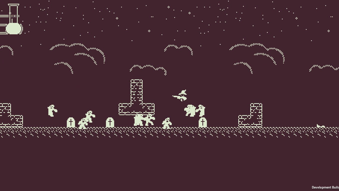
With that I had everything I needed to make the first level. At this point, I've been working on this game for at least a month. Making the first level was challenging, despite being simple from technical side. How long should a level be, before the player gets bored? How to show the basic mechanics, without telling the player what to do? Is walking from one point on the map to another fun?
The first level is divided in several small segments, separated by stone walls. The player can easily jump over. The first segment introduces the first gravestone. On the beginning of the second segment, a gravestone is places right bellow the wall. The idea was that the player had a high chance of jumping on enemy and discovering that you can damage them that way.
Next segment had several gravestones and spikes nearby. In it, the player could discover the enemies may also die from spikes.
The rest of segments are more of challenges than tutorials. After some playtesting, with my friends as players, it turned out that not everything I wanted to communicate, was communicated. Also the game was really hard!
.jpg)
After I finished with making the first level easier, it was time to make another one. The second level needed a new enemy type. As player's primary attack is shooting, it only made sense to make enemies that shoot at the player. I decided to start with a turret.
I already had a gun in the player's object, so I reused it. The hard part was to figure out, how to make the turret turn to player. To make things seem more fair to the player, I made it slower to turn. The bullets in the game are fast, but slow enough to dodge them, given the practice. To makes things a tiny bit harder, I made the shooting rate faster.
The next enemy was a combination of the previous two. In the initial concept, the gunman was supposed to partol the area until he sees the player. When in combat state, it should shoot at the player while avoiding bullets.
Fighting was already working. To make him partol, I made him walk to the end of the platform, wait a little and walk to another end. It was tricky to figure out how to make him detect the platform edge and walls in front of him. But I managed.
To make him see the player, I used raytracing. I know that raytracing is expensive, so it only works if the player is already nearby. Also it is not triggered on every frame. The game hardly suffers if the enemy is blind 4 out of 5 frames. But in return it reduces the effect on performance significatly.
I also added health refill items, that are dropping from enemies. The player health determines the drop rate. If health is full, they won't drop. The less health the player has, the higher the chance the drop will occur.
.jpg)
The second level was huge compared to the first one. It had several ways you could finish it. I'm really proud of it. Though you can still beat it in a couple of minutes.
The next playtest showed, that bullets were too fast, the firerate was too friquent and there were too many enemies. Also, enemies could shoot through walls. It happened because bullets only checked if they entered the collision with walls. But if they were spawned inside walls, they could damage the player on the other side. To fix it, I once again used raytracing. Not enemies can't shoot at all if they don't see the player directly.
I reduced the enemy count, reworked shooting a bit and added deagro conditions for walking enemies. If they can't see the player for a couple of second, they give up and start patrolling the area again. It made game much easier.
.jpg)
It was time to make another enemy. Now it will attack on close range. It has 2 types of attack. If the player is on the same level, he will use thrust attack, and if the player is higher, it will swing its blade. The hardest part about this enemy was to determine an appropriate distance at which he would attack the player. But in the end, I nailed it.
I made another room, filled with this enemy type. There were several platoforms above spikes. The player could either shoot them from distance, or lure them to spikes.
At this point I was going to make the first boss. But after several months of intense solo work, I was feeling a bit burned out from this project.


.jpg)
.jpg)
.jpg)
.jpg)
.jpg)
.jpg)
.jpg)

Try out the app: memorydreams.github.io/RockPaperScissors.
Source code: github.com/MemoryDreams/RockPaperScissors.
Try out the app: memorydreams.github.io/sketchbook.
Source code: github.com/MemoryDreams/sketchbook.
You can download the latest release of the game on itch.io.
Try out the app: github.com/MemoryDreams/CubeGame/releases/tag/Android.
Source code: github.com/MemoryDreams/CubeGame.
Sketchbook
Rock Paper Scissors
CubeGame
MicroVania
